
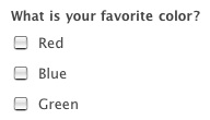
A few touch ups and fixes went up today for Reports that are worth noting. Most important is a change to the way checkboxes are now graphed. In the past, if you were given a checkbox as shown in the image to the right, the graph would be labeled based on the first choice, rather than the question. So in this example, you would select “Red” in the report builder to graph all of the checkboxes related to that question. This was a bug and while graphs could still be created, it was definitely confusing. That’s all behind us now because we fixed it so that you can select the title of the checkbox when adding graphs to your report. In this case, “What is your favorite color?” Much better.
The only tricky part is for those of you who may have selected the second or third choice like “Blue” or “Green” in the past. The graphs will still draw properly; however, when editing the report a re-selection will need to be made in some cases. In addition to that change, a few bug fixes have gone up as well:
– Most HTML in field titles will no longer break the report creation process.
– Graphs now properly display even when there are multiple conditions referencing the same field.
– Adjacent checkboxes can now all be graphed. Prior to this, only the first could be graphed.
– Multiple fixes to the process of duplicating a report.
###Query API
Why stop at reports? The [Query API](https://help.wufoo.com/articles/en_US/kb/Wufoo-REST-API-V3/query/ “Query API”) could use some beefing up too. Here are some of the enhancements we have made:
– Data can now be returned in both JSON and XML formats
– All parameters are now functioning properly when accessed from an outside URL
– See an [example in action](http://particletree.com/examples/json/ “Query JSON Example.”) or read about [how it was created](https://help.wufoo.com/articles/en_US/kb/Wufoo-REST-API-V3/query/examples/json-query/ “Query JSON Tutorial.”).
Comments
hm…,
Posted February 22nd, 2007 by nicolas.not want to be a smart-alec, but you guys are supposed to be the experts, so you ask for this 😉
The graphic shows checkboxes but you have a question that allows only for one answer. So you should either change to radios or reformulate your question (“What is/are your prefered color(s)?”)
… and i know that this is not really the topic about this post
Haha, good point. I think I spend too much time building form builders, and not enough time building forms 🙂
Posted February 22nd, 2007 by Ryan Campbell.Y’all have done a great job with every release of wufoo. We did a full walkthrough over at DemoMarks and needless to say I was impressed. Forms were always my weak area with web design and you’ve built a product that not only makes them look good but also gives users the ability to track their information. Great job, and I look forward to future developments!
Posted February 22nd, 2007 by Tim Owens.Glad we’re making your life a little bit easier, and thanks for that review, Tim.
Posted February 22nd, 2007 by Chris Campbell.That how it was created link in your last bullet point is a dead link.
Posted February 22nd, 2007 by John Topley.Hmm, that’s weird. It is working for me. It should go to this URL:
http://wufoo.com/docs/api/query/examples/json-query/
Posted February 22nd, 2007 by Ryan Campbell.It goes to that URL but I get a 404, at least from work. I’ve not tried it from home.
Posted February 22nd, 2007 by John Topley.Everyone needs a hug.
Posted February 22nd, 2007 by Majid.This link still leads to a 404 page.
http://wufoo.com/docs/api/query/examples/json-query/
Posted February 22nd, 2007 by Andrew.No idea why this is happening. It always go through for me, and the URL has never changed. Does it do somehting weird, like http://yourusername.wufoo.com/docs/…
Posted February 22nd, 2007 by Ryan Campbell.