By Chris Coyier
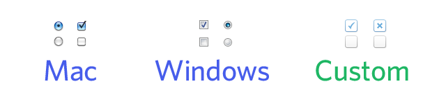
Thanks to the magic of CSS, we can offer our users a lot of ways to change the look of their Wufoo forms. Unfortunately, the visual look of checkboxes and radio buttons depend largely on the platform you are on and they’re a bit tricker to customize. Here’s Mac OS X Snow Leopard and Windows 7, next to a set of custom designed checkboxes:
Most techniques you’ll find on how to change the look of checkbox and radio fields tend to utilize JavaScript. They insert lookalike elements, hide the original input, and attach click event handlers to the lookalikes, which toggle the look as well as toggle the value of the original input. It’s all really clever, but won’t work on Wufoo forms because (for everyone’s good) we don’t allow you to run your own JavaScript on our forms.
Fortunately, there is a way to customize the look of checkboxes and radio buttons entirely through CSS! This technique was pioneered by Ryan Seddon in his article Custom radio and checkbox inputs using CSS. We’ve tweaked it a bit and will walk you guys through how to use the technique for your Wufoo forms.
Customization in Action
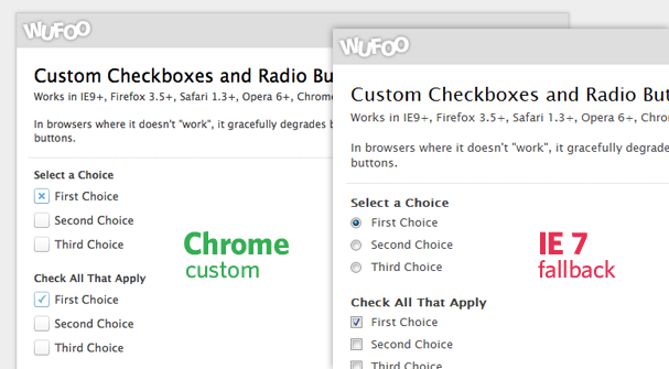
Just so you have an idea of what the end effect is going to look like when you’re done, we’ve whipped up a little example form showing off the custom styles.
1. Set up Custom CSS for your Form
You’ll need to create a new theme through our Theme Designer and apply that theme to the form. We have a tutorial on getting going with Custom CSS here.
2. Prepare the Images
We’ll prepare three different images. One for when the checkbox or radio button is not currently selected (off.png), a checkbox image for when a checkbox is selected (check.png), and a radio button image for when a radio button is selected (radio.png). Place these images in the same folder as where you are hosting your custom CSS file.
3. The CSS
Here’s the CSS, commented up for your reading pleasure, in it’s entirety
/*
    Hide the original radios and checkboxes
    (but still accessible)

    :not(#foo) > is a rule filter to block browsers
                 that don't support that selector from
                 applying rules they shouldn't

*/
li:not(#foo) > fieldset > div > span > input[type='radio'],
li:not(#foo) > fieldset > div > span > input[type='checkbox'] {

    /* Hide the input, but have it still be clickable */
    opacity: 0;

    float: left;
    width: 18px;
}

li:not(#foo) > fieldset > div > span > input[type='radio'] + label,
li:not(#foo) > fieldset > div > span > input[type='checkbox'] + label {
    margin: 0;
    clear: none;

    /* Left padding makes room for image */
    padding: 5px 0 4px 24px;

    /* Make look clickable because they are */
    cursor: pointer;

    background: url(off.png) left center no-repeat;
}

/*
    Change from unchecked to checked graphic
*/
li:not(#foo) > fieldset > div > span > input[type='radio']:checked + label {
    background-image: url(radio.png);
}
li:not(#foo) > fieldset > div > span > input[type='checkbox']:checked + label {
    background-image: url(check.png);
}
Place this in your Custom CSS file, which is where your theme points to, which is applied to your form, and thus will take effect!