
Hey Wufamily, getting excited about spring yet? In many countries, this time of year inspires people to do some serious cleaning at home. I promise I’ll get to it this weekend (or maybe next), but in the meantime I found an easy way to get at least some spring cleaning done.
I present to you… 6 great hacks for cleaning up your online form design. Put them to work for your forms now and enjoy a guilt-free rest of your week!
1. Design with a specific audience in mind
Make sure that you know very well who will be filling your forms. Are you creating a simple event RSVP form that you will send to acquaintances or coworkers, or a sales lead form that’s intended for prospects and potential customers? Keep your target user in mind as you design your form, since knowing what they need will educate your decisions about what to include and, as importantly, what not to include.
2. Choose the right field for each question
The thing with Wufoo, you know, is that you have so many field options to choose from to build a powerful, customized online form. That doesn’t mean you should use all of them every time. Let’s start making decisions based on your specific audience: Will users find it easier to answer a question through a dropdown, multiple choice, or checkbox field? Here are some guidelines…
- Multiple choice fields are better for when you have between 5 and 7 options from which the user needs to pick one. Check this example from our Event Satisfaction Survey template.
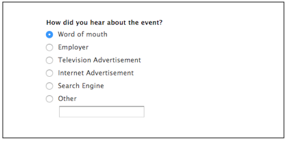
Note how a clever form designer included a catch-all “Other” option at the end, with an open-ended answer box to capture other alternatives.
Multiple choice fields are also very good for yes/no (binary) questions.
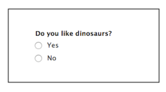
(Please don’t hurt our feelings saying ‘no’ to this one. Just kidding!)
- Dropdown menus are similar in use to multiple choice fields but they have two big advantages in certain cases.
First, they work better when you have more than seven options. Think, for example, about a “Country” field in an online order form.
But also they save you—and your user—a lot of vertical space, as you can see when you compare the two alternatives below.
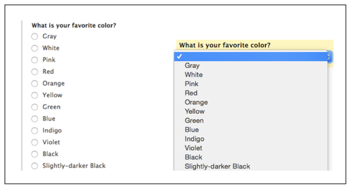
The dropdown field only takes up one line of vertical space as opposed to the long multiple choice list.
- Checkbox fields are the one type here that allows the user to select more than one option. Therefore, you should use them only when you want users to be able to select several choices—to think outside the box, so to speak.
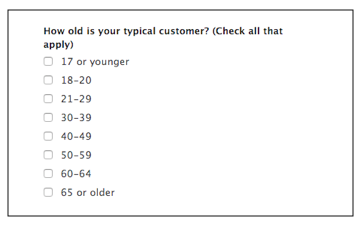
Check out this example from our Typical Customer Demographics form template.
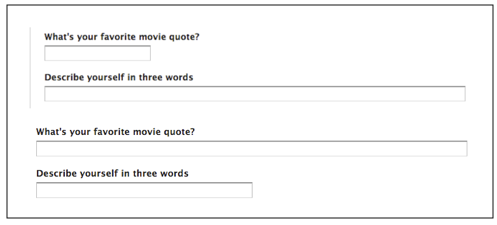
3. Use field size as a hint for users to write just enough
You know you can change the size of your fields, but did you know that this can become a subtle hint to your users as to how much they need to write in their answers to your questions? Yes, since you can adjust each field’s size separately, you can signal how much text you’re expecting in response to each. Compare the two versions below.
4. Hide fields until they are needed with Field Rules
As more and more users move into performing every task on the go, it’s important to remove any clutter from their line of sight (and their mobile screen). Wufoo forms can adapt to every user, so that for example fields that become irrelevant based on previous answers don’t even appear on screen. To keep your form clean and minimalist, use Field Rules to hide optional or conditional fields from users who don’t need to fill them.
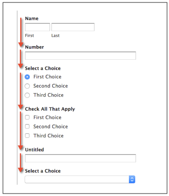
5. Keep users on the right (vertical) track
Columns are not always your best friend on a web form, so make sure to use a vertical layout whenever possible. For example, First and Last Name should go next to each other, but Name and Address should probably be organized vertically. This will make things easier for the user scrolling down your form, whether on a desktop screen or on a smartphone. Keeping things simple with a single column can be of great help to them.
Don’t:
Do:
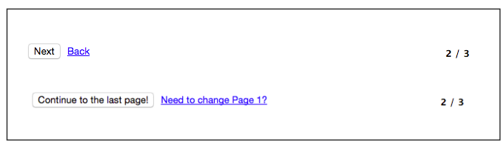
6. Use customized button labels to guide users
When using labels, there’s always the opportunity to look at your form through the eyes of your users and think what information they need to be able to complete your form quickly and efficiently. Sometimes, “Next” or “Previous” is all that you need—but in other cases customizing the text to fit your form can give users that extra tidbit they need to understand the flow of things. Make sure you provide that, telling users what’s coming up and what they just left so they can move between pages quickly. Check out the two versions below:
If the idea of organizing your home hasn’t got you excited about spring, hey, I don’t blame you! But at least I hope these 6 hacks from our Wufoo form experts did motivate you to create great-looking, cleanly-designed forms so that you can make spring (and life) better for your users!