
There is no doubt people are using the web more and more on devices with smaller screens than you have at home on your desk, on your laptop, or even your “tablet” device. Wufoo forms already look great on the iPhone, but now we’ve recently pushed out some changes that make Wufoo forms work better on any small screen.
##Hosted Wufoo Forms
For forms directly on wufoo.com, they have an appropriately sized fixed with:

But that fixed size didn’t suit small screens very well. Now we’ve tweaked things so that on smaller screens, the form simply utilizes all available width, without the spacing and background. Here’s a Wufoo form on a Galaxy Nexus:
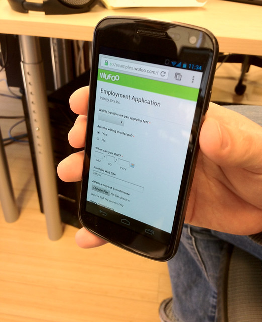
Sexy, eh?
##Embedded Wufoo Forms
Forms that you embed onto your own sites have always worked pretty well across different available widths. They simply fit snuggly into whatever horizontal space is available.
There was one little hiccup though, and that’s if the screen was resized after the page had loaded. If the screen became narrower, there was a chance that text on the form would wrap, pushing things down and sometimes, sadly, hiding the form’s vital “Submit” button.
We’ve fixed this issue, and the `iframe` that contains the Wufoo form will resize to the appropriate height, and the submit button will always be safely visible!
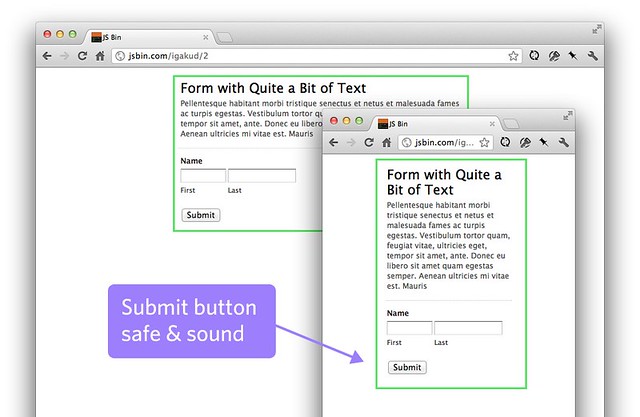
If you’d like to see this in action, visit this page and resize your browser window.
##Remember, you can control the CSS!
You are ultimately in control of how your form looks. For those of you with some CSS skills, you can apply custom CSS to your form. If you have specific needs for how you’d like your form to look on screens of different sizes, you can apply responsive design techniques through your custom CSS to control that.
Comments
Great work, it was really needed since all forms need to look good in smartphone nowadays.
Can I make two wishes?
1) Automatic generation of QR-code for the form
2) Better design for the reports in a smartphone
Posted February 14th, 2012 by Gustav.I would need this for polls directly in the phone. You can create these by making a question-form, and when the form is submitted the users is directly taken to the report, where they can see the result.
I have tried this at seminars where I ask the audience to scan in the QR-code of the link to the form directly from a slide on the projector screen. It works perfectly except that the report is not really readable in the smartphone.
This is great! I needed this and didn’t even know it.
Posted February 14th, 2012 by Jamie with ByteBuyers.com.At first I thought – Fabulous! And then I tried one of my longer forms, which displays very well on a computer screen. I hit the above mentioned “hiccup” without re-sizing the screen on my Blackberry 8900. Not only can you not reach the very important “Next Page” button on this 2-page form, you don’t see the last 13 fields on the page …
Posted February 14th, 2012 by Kay.Great work! I have a mobile website business and have already integrated my signup and payment forms on my mobile site.
Posted February 14th, 2012 by Rocky.I want to know how to effectively use CSS in changing my blogger blog. Anyone with great ideas?
Posted February 14th, 2012 by Jude.