

It’s easy to let clutter accumulate during the year and all that junk can really make life more difficult. Likewise, forms often end up with incorrect or unnecessary design elements that will frustrate users. So roll up your sleeves because we’re going to get started on some spring cleaning!
Know your audience and design to their expectations
An inventory checklist for your co-workers will differ greatly from a public newsletter signup, for example. This one is more general, and not a specific action to take, but it’s important to keep in mind for the rest of the tips. The following suggestions won’t apply identically to every form, and the best form design will depend on your specific goals and users.
Use the best field for the job
With Wufoo, we provide a bunch of different fields to ensure you have the right tools available while building your form. However, sometimes forms use a less than ideal field and that can cause that range of choices to backfire.
Our fancy pants fields like Address, Email or Website are pretty easy to use correctly, but the standard field types can be a bit more tricky. Dropdown, Multiple Choice and Checkbox fields are the usual troublemakers. In general, here’s where each field is best suited for the job:
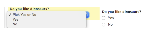
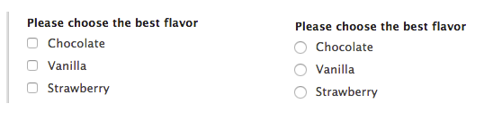
- Multiple Choice: Use when you have 5-7 options and a user can/should only pick one. These fields are perfect for Yes/No or similar “binary” questions.
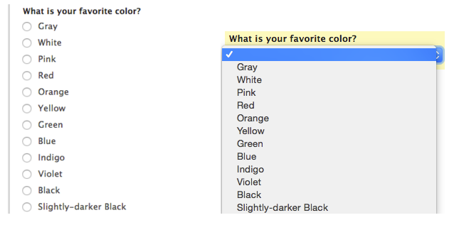
- Dropdown: Like Multiple Choice, but better when you have more than 7 options, of if you’re trying to save vertical space (embedded forms can benefit greatly from this).
- Checkbox: The only field of the three that allows for more than one option to be selected. If a user should be able to select multiple choices, Checkbox fields are the way to go. They can also be great for situations that only allow a single choice (like an opt-in or confirmation field).
#2: Adjust field size to match desired input
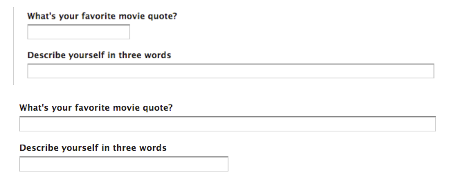
We’ve discussed some of the advantages to changing field size before, but another great use for the field size is to signal your expectations. Since you can adjust each field’s size separately, don’t hesitate to experiment a bit and observe how the entry data you receive changes accordingly. Our built-in Address field uses this approach by keeping some fields full-width and setting others to be shorter.
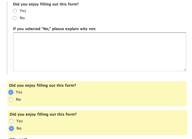
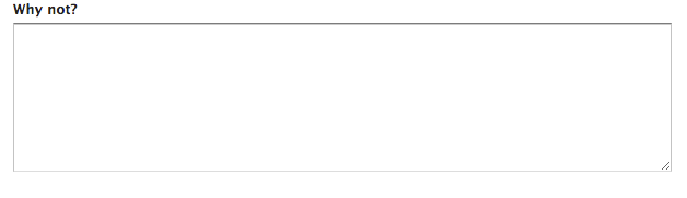
#3: Only show fields when they’re needed
One of the great advantages of online forms over paper is that you can add and remove fields in response to user input. While a paper form needs to include every possible field, online forms like Wufoo can adapt to the individual user. To keep things clean and simple, consider using Field Rules to hide optional or conditional fields when they aren’t relevant to the particular entry. We’ve got even more info using Field Rules to adjust your fields here.
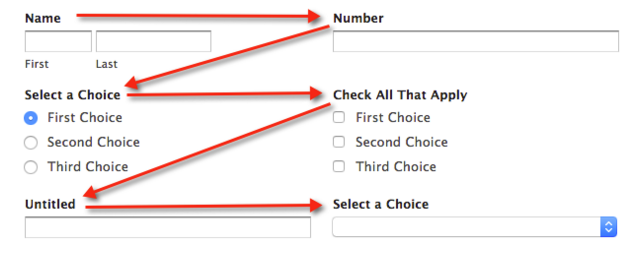
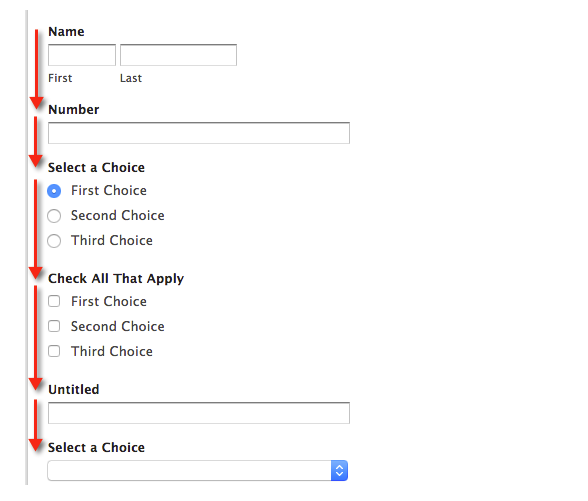
#4: Give users a clear path
To maximize the available space, paper forms often rely on a multi-column format. With online forms, multiple columns can be a useful tool for replicating a familiar layout (Address fields are a great example again), but overuse of columns can make things more difficult for the user. Having to scan back and forth to find the next field is tiresome and the increased width can often interfere with a mobile-friendly design, so keeping things simple with a single column can be a significant improvement.
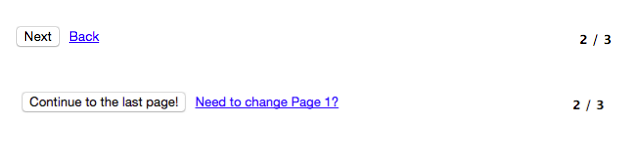
#5: Customize button labels to provide context
While the standard “Next Page” and “Previous” labels will get the job done, tailoring the text to fit your specific form can be an easy way to improve the user’s experience. Giving users an idea of what’s coming up, or what they just left, can make moving between pages pain-free. This can be especially important when you have more than a few pages, since a user may not be able to remember where they are in the process. If you’re feeling particularly bold you can customize the “Submit” button as well, for another opportunity to delight your users.
Questions for Michael? Let him know below!
Comments
Great refresher. Thanks!
Posted March 2nd, 2016 by Charity.Great tips, thank you.
Posted March 2nd, 2016 by Tom.If you export your form data into spreadsheets, the choice of field type (check box, drop down, etc.) greatly influences how the data is organized in the spreadsheet, and how easy (or not) it is to sort, count, merge data into other documents, etc. It would be helpful to show your clients what the spreadsheet results are from choosing different field types.
Posted March 2nd, 2016 by Judi Medlin.@Judi That’s a great idea. I’ll speak with our content team and see if we can put something together!
Posted March 2nd, 2016 by Cody Curry.