
Hey, hey, hey digital monsters! Over the weekend, we pushed out our second major redesign of the Wufoo website. There’s still a few pages that need to be converted to the new look, but we thought it would be okay to share what we have so far. You can get a good feel for the bright and shiny from our [homepage](http://www.wufoo.com/) and by exploring most of the links from there.
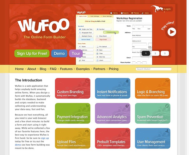
In addition to updating the aesthetic to a more contemporary look (our little login t-rex got a nice upgrade!), the new design gives us a lot more flexibility to experiment with how we visually communicate the value of Wufoo to our newest users and fans. The foundation actually sits on top of a pretty cool responsive grid system that we designed in house, which means it should look pretty good on whatever screen is front of you. And don’t worry, while we did pack it with a ton of HTML5 and CSS3 goodness, we want you to know that increased clarity was our primary objective. Here’s a few of the things we did towards that goal:
– Built a modular slideshow system to communicate news and features much easier on any landing page.
– Designed a sticky table of contents to help users deep link and navigate the content on any landing page.
– We put our new [promotional video](http://www.wufoo.com/2011/03/10/wufoo-promotion-video/) at center stage on the home and features pages.
– Revamped our [Features page](http://www.wufoo.com/features/) away from being checklist oriented and focus on highlighting how our UI benefits users directly in plain English.
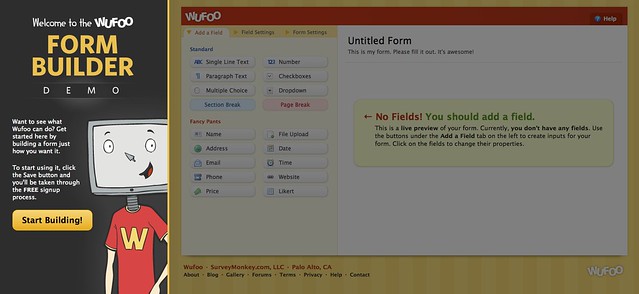
##Try the Form Builder Demo!
One of the new toys that comes with this redesign is the ability to play with [Wufoo’s Form Builder](http://www.wufoo.com/form-builder/) without having to create an account. Now, you can play around with or show off how easy it is to use Wufoo without having to login or fill out a bunch of registration fields. And if you like what you see, you can easily save the work and we’ll guide you into account creation when you’re ready.
Since we’ve always been dedicated to good type design around here (our last design actually featured a font we heavily customized that’s no longer in production and therefore was unique only to our site), we were delighted to be able to use one of our favorite integration parters, [Typekit](http://typekit.com), to help deliver the typographic magic. One of the nice side effects of this change is we’re not communicating text in images anymore, which is going to make it a lot easier for us to finish up our international versions of Wufoo that we’ve been furiously putting the final touches on.
##Think of it as a Preview
Currently, the redesign is limited to just the marketing stuff on the site, so you won’t see anything new when you login…yet. But I want you to know that we’re definitely planning to migrate both the feel and a lot of the lessons we learned over to the application side of things in the near future. Until then, we’ll be rolling out this bad boy to our other marketing pages, blog and documentation over the next few weeks. We’re really proud of new look and hope you guys enjoy all the little touches we put into it. Please do look around and let us know what you think.
Comments
OMG, Hideous and choppy homepage. Large fonts are very jaggedy along the edges. UGLEEE! Part of what made wufoo.com feel friendly were the playful use of fonts. You could have kept that using Typekit or something similar. The only remnant of that is on your Play Video button. Now all your fonts seem tall and skinny like a NY designer’s jean pant legs. You killed all the energy. Thank God you didn’t change the look of the backend. Design took a step back not forward . Better luck on the next design. 5+ year wufoo paying customer saying this. Not some schmo using 1 form a couple times a month on free version. I love you guys, but this design is beneath you and what you have created for the wufoo product.
Posted January 31st, 2012 by Ben Tupper.Just read you will apply this styling to the application of side of things. Be careful. You are tampering with something that doesn’t need to be tampered with.
Posted January 31st, 2012 by Ben Tupper.Everyone needs a hug.
Posted January 31st, 2012 by Kevin Hale.Wow, I absolutely love the new homepage! However, can you make the video on the first slide not autoplay (or at least require a click rather than a simple mouseover)? I keep accidentally hovering over it when I click the login button and the autoplaying sound is getting a little annoying.
Posted January 31st, 2012 by Jeremy.Red color is too bright. Hurting my eyes! 😛
Posted January 31st, 2012 by Rahul Bansal.Please crosscheck red-slide on a Mac.
Wow!! I can’t believe how harsh everyone is being!! I agree with Kevin people need some big bear hugs. I think the new site looks awesome!! Great job, from a company with an even better service! I can totally tell Chris Coyier had a huge part in this redesign. Great job. I do agree with the whole click vs hover for the video on the first slide, but that’s more of a preference.
Keep up the great work guys. I love how you are constantly improving your services. Keep it up.
(From a long term customer with many, many forms in use)
Posted January 31st, 2012 by Mike.Looks awesome! There are some fun/creative uses of CSS3 going on, many of which I recognize from css-tricks.com. One note: things get a bit choppy for me when the slider on the homepage transitions. Anyone else seeing that?
Great work!
Posted January 31st, 2012 by Scott.This is a company that listens . . . wow. Just a few hours ago i agreed with a comment originally posted by Jeremy about the play button on the homepage. . . and i come back to the site this evening, and would you look at that . . the rollover effect is gone. You guys rock. (Not just because of this, this is just a small thing). My hat’s off to you amazing folk at wufoo.
Posted January 31st, 2012 by Mike.I like the new design of the site, the only negative I can think of is the header and footer colour transitions are took quick and harsh on the eyes (perhaps slow it down or make it fade in)- Other than that I love the functionality you guys provide so we can’t really complain!
Posted January 31st, 2012 by James Todd.Everyone needs a hug!
I like it good job guys!
Posted January 31st, 2012 by Tyler.Hi there, if your are looking for feedback about your new design looked of your site then I think (just commenting on the homepage) that it is a visual step backwards. The design over powers the content making it hard to direct me to the content that I need to know (find) about.
The categories are colored but it is way to dominant and the icons are muted into the color which I dont get as I dont really link the color to a specific category straight up, the icon would mean more to me visually. When you click a category eg Custom Branding the color doesn’t flow through so Im not sure why use not try and link this in same with the use of the icon, its just hard to follow and link up to what I need to read.
Loose the swirling background and its repetition its just over the top with the bright colors, the use of the bright colors too make whitewash the site too, its hard to tell what is clickable or what is static graphic.
I do like your typography on the content pages, nice to read and your about us page is fun : )
Posted January 31st, 2012 by Bjarni Wark.Everyone needs a hug, especially my grammar, see above : )
Posted January 31st, 2012 by Bjarni Wark.Everyone needs a hug. i can’t green more
Posted January 31st, 2012 by Zhangxingxiang.Type is appearing on top of other type, and I thought my Chrome browser was broken. But I expect you will fix the glitches. Also please open-source that responsive grid thing you made.
Posted January 31st, 2012 by What The Foo.